


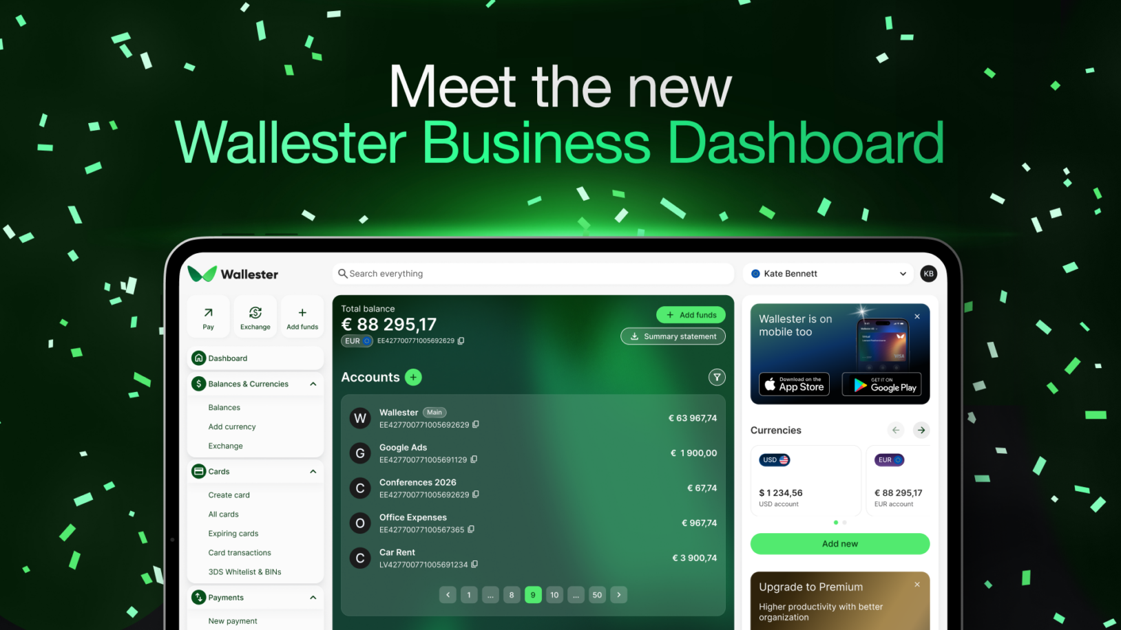
The Wallester Business Client Portal has a new dashboard, and the point is straightforward: less jumping around, faster access to what matters, and a cleaner, more centralised view of daily financial activity.
It is much more than a visual refresh meant to make the platform look more contemporary. The redesigned dashboard changes how information is organised inside the Client Portal by bringing recent activity, account visibility, quick actions, and useful shortcuts closer to the surface. In short, clients can now move through everyday finance operations with less friction.
For companies managing multiple cards, accounts, currencies, teams, subscriptions, and payments, that matters. The more activity runs through the platform, the more important it becomes to see the right information quickly.
A More Useful Starting Point
The dashboard is the first place users land when they open Wallester Business, but it should not simply show that the platform exists. It should help users immediately understand what has happened, what is happening, and what to do next. That is what we wanted to achieve with this redesign.
Simply put, the new layout gives the dashboard a clearer operational role. Instead of navigating through several sections to check recent financial activity, users can get a faster overview of recent actions as soon as they log in.
One of the main additions is the new “Your highlights” section. It brings together the latest financial activity, including recent transactions and add funds history. For finance and operations teams, this removes a common source of friction: checking several places just to see what has happened recently.
Clearly, this is useful for companies that spend across different teams and workflows. For example, a marketing team may be running ad spend across several platforms, while an operations team may be managing supplier payments. The “Your highlights” section gives users a faster first answer when it comes to those kinds of activities.
Faster Access to Common Actions
The update also introduces utility widgets that give quicker access to everyday actions and resources. These are available in the dropdown menus on the left side of the layout and include shortcuts for key workflows, currency-related actions, and helpful links inside the Client Portal. The goal is not to overload the dashboard with everything, but to reduce the number of steps required for common tasks.
Small navigation improvements matter in finance operations because many tasks are repeated daily. Users check balances, review transactions, monitor funding activity, exchange currencies, access statements, move between accounts and cards, and so on. The new dashboard is designed to make those routines feel less scattered.
The experience is also consistent across desktop and mobile, so users can move between devices while keeping the same basic logic and visibility.
Built to Keep Improving
The new widget area has been built with future updates in mind. Over time, it may include more shortcuts, feedback links, surveys, educational resources, and other tools designed to make the Client Portal more useful. In other words, the dashboard is becoming a more active space for product guidance and user support instead of just displaying information.
That is important because the way companies use Wallester Business keeps evolving. Some users come in mainly to exchange currencies or check balances. Others monitor recent transactions, look for specific account activity, manage payroll-related spending, or issue hundreds of cards daily. We wanted the dashboard to support those different behaviours without becoming harder to use.
The redesigned Wallester Business dashboard is now live in the Client Portal. If you already use Wallester Business, simply log in and take a look. And if you do not, you can create a free account today and see how the new dashboard helps you manage cards, spending, and daily financial activity from one place.

