We are thrilled to share that we’ve rolled out a significant redesign of our client portal, tailored to provide you with a more streamlined, intuitive, and efficient experience.
What We’ve Enhanced:
1. Minimalistic and Clean Style: Our new design boasts a cleaner typography and a refined colour palette, emphasizing a modern and minimalistic approach.
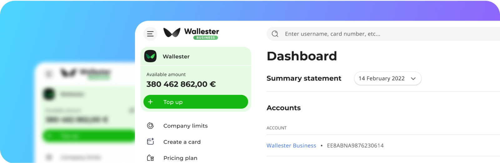
2. Intuitive Structure: We’ve reconstructed the header and sidebar with an even more logical flow, ensuring that your navigation is smooth and your daily tasks are easier to accomplish.
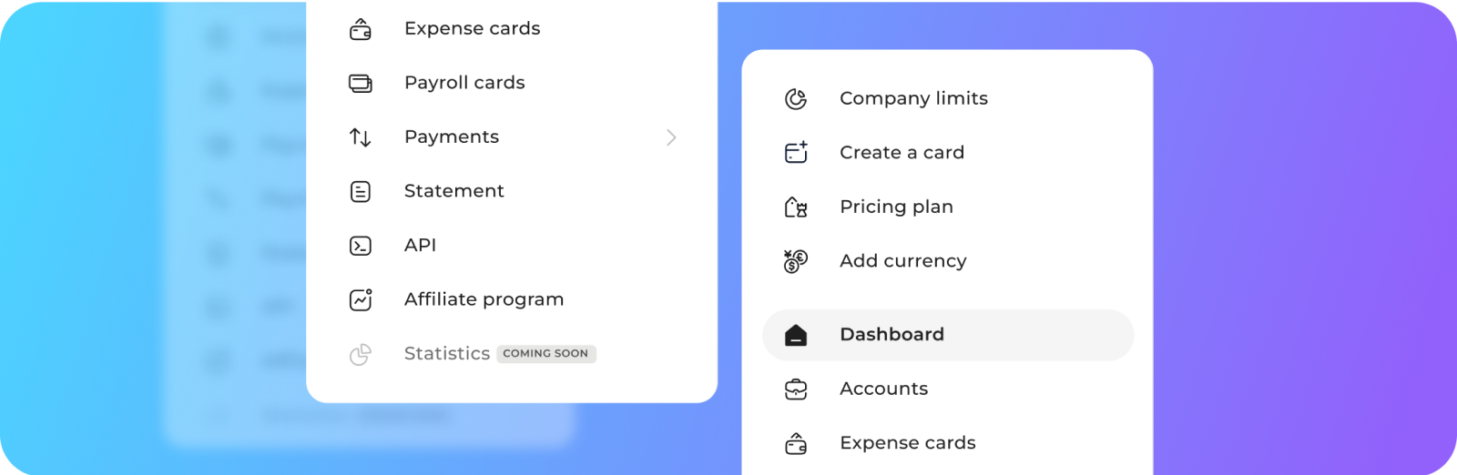
3. Adaptable Sidebar: We’ve upgraded the sidebar to provide a more user-friendly experience on smaller screens, ensuring effortless navigation on devices with limited screen space.

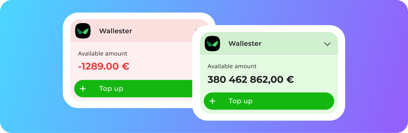
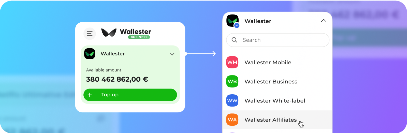
4. Informative Balance Block: Your balance block is now colour-coded, offering an immediate visual cue when funds are low.
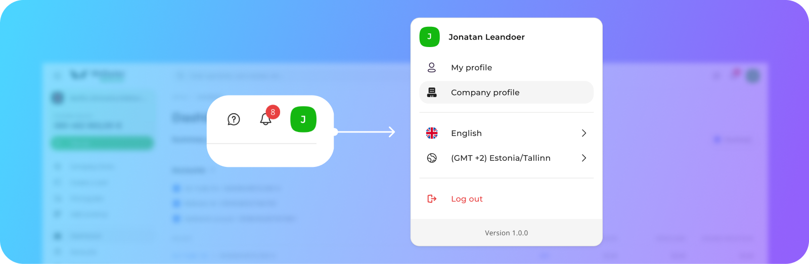
5. Efficient Profile Switching: Transitioning between profiles has become more effortless.
6. Consolidated Settings: All settings, including those for users, companies, and more, have been relocated to the top right corner for easy access.